Charli XCX Brat Album: Complete Style Guide (2026)
The real design story behind the green square that took over the internet – color, font, and how it became a cultural phenomenon.
In this guide
- Quick answer
- The album, quickly
- The design story nobody tells right
- The exact color and font
- How “brat summer” became a cultural phenomenon
- Recreate the look yourself
- Common mistakes
- FAQ
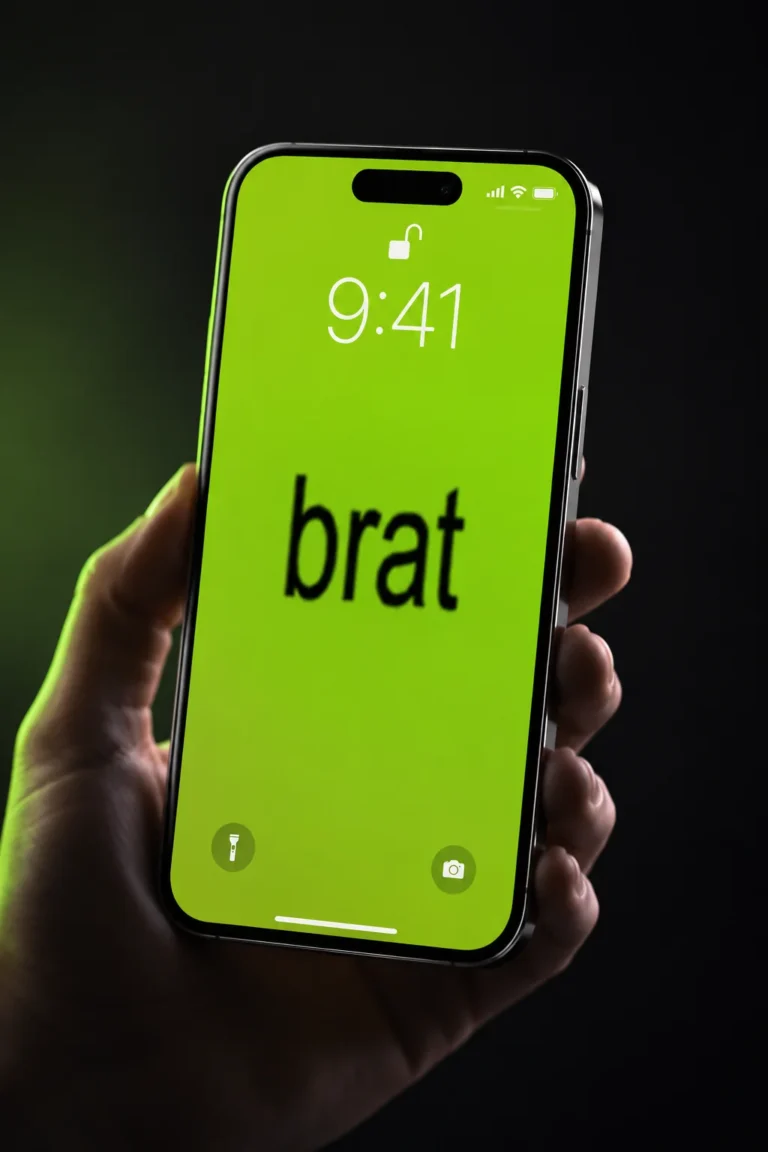
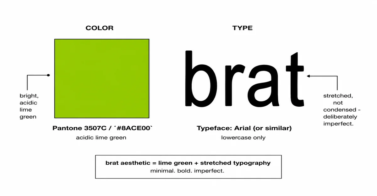
The Brat album cover is a lime-green square (Pantone 3507C, commonly rendered as hex #8ACE00) with the word “brat” set in lowercase, slightly stretched Arial-based type. Designer Brent David Freaney tested around 500 shades of green over a five-month process before landing on one Charli XCX called deliberately “off-trend.” That plain design became “brat summer” – Collins Dictionary’s 2024 Word of the Year.
The Album, Quickly
Brat is Charli XCX’s sixth studio album, released on 7 June 2024 through Atlantic Records. It peaked at number one in the UK, Australia, and several other countries, reached number three on the US Billboard 200, and was later shortlisted for the Mercury Prize. At the 67th Grammy Awards, Brat and its songs picked up nine nominations and three wins, including Best Dance/Electronic Album. A deluxe edition followed on 10 June 2024, and a full remix album featuring 20 guest artists, titled Brat and It’s Completely Different but Also Still Brat, was released on 11 October 2024.
None of that chart or awards context is why most people searching for this actually care, though. What made Brat different from every other pop album release that year was the cover – and specifically, how ordinary it was on purpose.
The Design Story Nobody Tells Right
Most articles covering the Brat aesthetic describe the cover in one sentence – “green background, lowercase text” – and move on. The real story is more specific, and it explains why the look works.
The artwork and packaging were designed by New York City-based studio Special Offer, Inc. Despite how simple the finished cover looks, it went through a five-month development process. Designer Brent David Freaney reportedly examined around 500 different shades of green before landing on the final one – deliberately chasing an “off-putting, garish effect” rather than a conventionally attractive color.
Charli XCX herself explained the choice directly: she’d noticed that green was already heavily oversaturated in fashion and media, so she wanted “an offensive, off-trend shade of green to trigger the idea of something being wrong.” The typography follows the same logic. It’s based on Arial – not a custom or premium typeface – specifically because Freaney wanted something that felt un-precious. The text is slightly stretched to “give it a personality,” and placed slightly awkwardly on purpose: not small and tasteful, not large and loud, sitting deliberately in between.
That’s the part most style guides for this trend skip entirely: the plainness isn’t a shortcut. It’s the actual design decision, made carefully, on purpose, by people who could have made something more polished and chose not to.
The Exact Color and Font
For anyone recreating the look, precision matters more than most people assume – a slightly wrong green reads as “generic lime,” not “brat.”
| Element | Value |
|---|---|
| Pantone | 3507 C |
| Hex | #8ACE00 |
| RGB | 138, 206, 0 |
| Typeface base | Arial, lowercase, slightly stretched |
| Text treatment | Soft blur on later remix/tour variants |
For the full breakdown of exact color values across formats, see the brat color code guide. For getting the lowercase, slightly-imperfect type treatment right, see the brat font generator.
How “Brat Summer” Became a Cultural Phenomenon
The design itself didn’t go viral – what people did with it did. A few specific, documented moments explain how an album cover became a cultural shorthand:
- The Brooklyn “brat wall.” In the weeks around the album’s release, a wall in Greenpoint, Brooklyn was repeatedly painted and repainted in the album’s green, with messages that changed in step with the album’s rollout – starting with a lyric from the single “360,” then simply “brat,” later shifting to promote the deluxe edition, and eventually reading “ok bye!” on 1 July 2024.
- The Kamala Harris moment. In July 2024, Charli XCX tweeted “kamala IS brat” about then-Vice President Kamala Harris. The Harris campaign’s official account rebranded itself “Kamala HQ” and adopted the album’s exact green-background, lowercase-text visual style. Charli XCX later said it wasn’t intended as a formal endorsement, but the moment pushed the aesthetic far outside music and pop-culture circles into mainstream political news coverage.
- Collins Dictionary’s Word of the Year. On 31 October 2024, Collins Dictionary named “brat” its Word of the Year, defining it as being “characterized by a confident, independent, and hedonistic attitude” – a rare case of an album aesthetic reshaping how a word gets used in everyday English.
- Landmark and political spillover. London’s London Eye was lit up in lime green on the album’s release day. The Green Party of England and Wales later posted its own version of the cover reading “vote green” during the 2024 UK general election campaign.
Each of these moments reused the same two design decisions – the specific green, and the plain lowercase type – which is part of why the look was so easy for other people to copy accurately. There was very little to get wrong.
Recreate the Look Yourself
Getting the aesthetic right without a design background comes down to matching the same two decisions Freaney and Charli XCX made deliberately: the specific shade of green, and type that looks intentionally plain rather than polished. Free tools built specifically for this – like the brat generator – already have the exact color and a matching lowercase type style built in, so there’s no need to hunt down the right hex code or font manually. Type a word or short phrase, and the output already matches the reference far more closely than eyeballing a “close enough” green in a general design tool.
Common Mistakes
Mistake: Using a generic “lime green” instead of the actual shade.
Most stock lime greens read as noticeably brighter or more saturated than Pantone 3507C / #8ACE00. The whole point of the original choice was that it looked slightly “off” – a too-clean green misses that on purpose.
Mistake: Using a clean, polished font.
The plainness of the Arial-based type is the design decision, not a placeholder. Swapping in a stylized or decorative font undoes the exact effect that made the original cover work.
Mistake: Adding extra graphics, borders, or effects.
The original cover has no imagery beyond flat color and text. Adding gradients, icons, or borders moves it further from the reference each time, even if each individual addition looks fine on its own.
Mistake: Assuming the album’s music is required context.
The visual trend spread well beyond people who had listened to the album – it became a design and cultural shorthand on its own. Recreating the look doesn’t require referencing specific songs or lyrics to be accurate or recognizable.
FAQ
When was the Brat album released?
Brat, Charli XCX’s sixth studio album, was released on 7 June 2024 through Atlantic Records.
Who designed the Brat album cover?
The cover and packaging were designed by New York City-based studio Special Offer, Inc., with designer Brent David Freaney credited with the color and typography decisions.
What is the exact brat green color code?
The color is Pantone 3507 C, commonly rendered online as hex #8ACE00 (RGB 138, 206, 0). See the full brat color code guide for CMYK and other format values.
What font is used on the Brat album cover?
The type is based on Arial, set in lowercase and slightly stretched. It was chosen specifically because it feels plain and un-precious rather than stylish.
Why did Charli XCX pick that specific shade of green?
She has said she wanted an “offensive, off-trend shade of green to trigger the idea of something being wrong,” after noticing green was already oversaturated in fashion and media at the time.
What is “brat summer”?
Brat summer is the cultural phenomenon that grew out of the album’s aesthetic and attitude during 2024, encompassing fashion, memes, and a widely reused visual style. Collins Dictionary named “brat” its 2024 Word of the Year as a result.
What was the Kamala Harris “brat” moment?
In July 2024, Charli XCX tweeted “kamala IS brat” about then-Vice President Kamala Harris. The Harris campaign’s account rebranded itself “Kamala HQ” using the album’s visual style, which brought the aesthetic into mainstream political news coverage.
Can I recreate the Brat style for my own posts?
Yes. A free brat generator tool can produce the correct green background and lowercase type style in seconds, without needing to manually match the exact hex code or font by hand.
Is the Brat aesthetic still relevant in 2026?
The specific 2024 cultural moment has passed, but the design style – flat saturated color paired with plain lowercase type – continues to get used broadly for memes, profile pictures, and quick graphics well beyond the original album cycle.
Design facts and timeline in this guide are sourced from Wikipedia’s documentation of the Brat (album) artwork and marketing history, and from Collins Dictionary’s 2024 Word of the Year announcement coverage.