How to Make a Brat Album Cover Online for Free
The exact color, the exact font, and the export size that actually fits – step by step.
In this guide
- Quick answer
- Step-by-step: how to make a brat album cover
- Getting the color and font right
- Recommended settings: size, spacing, blur, chaos
- One-word cover vs. long-phrase cover
- DPI and print resolution, explained
- How to make a cover on mobile
- PNG vs JPG vs WebP vs SVG
- Best image sizes for every platform
- Common mistakes
- Export quality troubleshooting
- Text invisible? Download not working?
- Example settings by use case
- Brat generator vs Canva vs Photoshop
- FAQ
To make a brat album cover online, use a free brat generator: type your word or phrase, set the background to the correct lime green (hex #8ACE00), apply a lowercase stretched font with a soft blur, then export at the right size for where it’s going – a square social post, an Instagram Story, or a higher-resolution size if you’re printing it. No design software or account is required.
Step-by-Step: How to Make a Brat Album Cover
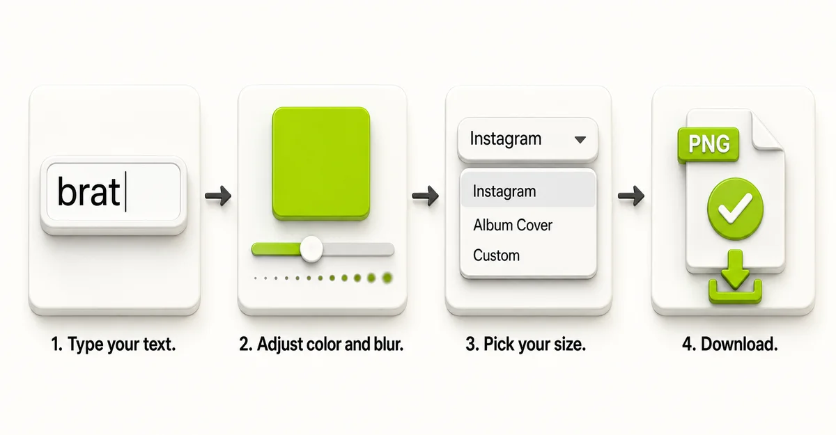
These steps work with any browser-based brat generator, including the free tool on this site:
- Type your text. A single word or short phrase works best – the original album cover uses just one word, and shorter text stays readable at small sizes like a profile picture or thumbnail.
- Set the background color. Use the correct lime green (#8ACE00) rather than a generic “green” swatch – a slightly-off shade is the most common reason a result looks close but not quite right.
- Apply the blur and distortion. The original cover’s text isn’t perfectly crisp – a soft blur combined with a slight skew is what gives it that deliberately imperfect look. A single “chaos” or “distortion” slider (if the tool has one) is faster than adjusting blur, skew, and grain separately.
- Choose your export size. Pick a size that matches where the image is actually going – see the size table below – rather than downloading one default size for everything.
- Download or copy your image. PNG keeps transparency and sharp edges for most uses; save a higher-resolution version separately if you’re printing it.
You can create your own with the free brat generator on this site – it has the correct green built in by default, along with size presets so step 4 above is a dropdown instead of a manual pixel calculation.
Getting the Color and Font Right
Two details separate a cover that reads as “brat” from one that just looks like green text, and both are easy to get slightly wrong.
The color. The verified background color is hex #8ACE00 – a specific, fairly acidic lime green, not a generic bright green. Some tools and guides default to a noticeably different shade, which is close enough to pass a glance but reads as “off” next to the real thing. For the full color breakdown across formats, see the brat color code guide.
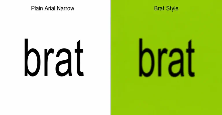
The font. The text is set in Arial Narrow, in lowercase, then stretched and given a soft blur. It isn’t a bold or heavy weight font, and it isn’t Helvetica – those are different typefaces that can look similar at a glance but don’t match the original letterforms up close. For a side-by-side breakdown of how this compares to other fonts, see the brat font generator guide.
Recommended Settings: Font Size, Letter Spacing, Blur, and Chaos
Most brat generators, including the one on this site, use the same four sliders to control how the text looks. Here’s what each one actually does and where to start:
| Setting | Typical Range | Good Starting Point |
|---|---|---|
| Font size | 24-260px | 140-180 for a single word, 60-90 for a longer phrase |
| Letter spacing | -10 to 40 | -2 to -4 (slightly tight, matches the condensed original look) |
| Line height | 70-160 | 100 for one or two lines; lower it slightly once you’re past three lines |
| Chaos (blur + skew + noise combined) | 0-100 | 50-60 for the classic distressed look, 15-25 if the text still needs to stay easily readable |
The “chaos” slider is worth understanding rather than just dragging until it looks right: on the tool used for this guide, it scales blur, skew, and grain together from one control, up to roughly 3px of blur and an 8-degree skew at full strength. At 60 – the setting behind the classic preset – that works out to a soft ~1.8px blur and a ~4.8-degree tilt, which is enough to read as the distressed album-cover look without making the text hard to read. Pushing it past 80 starts to trade readability for the effect, which is fine for a poster or meme but works against you on anything meant to be read quickly, like a thumbnail.
Example: One-Word Cover vs. Long-Phrase Cover
The right settings change depending on how much text you’re placing, since a single word and a full sentence behave differently at the same font size.
One word (example: “brat”)
A single short word can run large – font size 160-200 – with letter spacing pulled in slightly tighter (-4 to -6) and chaos pushed higher (50-70) without losing readability, since there’s only one word to parse. This is the closest match to the original album cover’s layout.
Long phrase (example: “this is not a phase”)
A longer phrase needs a smaller font size (60-90) to avoid overflowing the canvas, letter spacing closer to neutral (0 to -2) so the words don’t crowd into each other, and chaos dialed back (15-30) – heavy blur on multiple words compounds fast and can make a full sentence genuinely hard to read at a glance. If your text is wrapping unpredictably or spilling past the edges, reducing font size before adding more chaos usually fixes it.
DPI and Print Resolution, Explained
DPI (dots per inch) is just the relationship between how many pixels an image has and how large it prints without looking soft. A screen doesn’t care about DPI – only the pixel count matters there – but a printer does, because it’s mapping a fixed pixel grid onto a physical inch measurement.
Standard print quality is 300 DPI. That means a 3000 x 3000 pixel image – the “Album Cover” size preset – prints cleanly at up to 10 x 10 inches (3000 ÷ 300 = 10). For a standard CD-sized cover (about 4.7 x 4.7 inches), that same file is well past 300 DPI and has room to spare. For a full 12-inch vinyl-style cover, you’d want closer to 3600 x 3600 pixels to hold 300 DPI at that larger size – worth using a custom export size rather than the default album preset if you’re printing at that scale.
How to Make a Brat Album Cover on Mobile
The same steps work on a phone browser, with a couple of practical adjustments:
- Open the generator in your phone’s browser – no app needed, and it works in both Safari and Chrome on mobile.
- Type your text using the on-screen keyboard, same as desktop.
- Adjust sliders with a tap-and-drag rather than a click – touch targets on color, size, and chaos controls work the same way, just with your finger instead of a mouse.
- Use the Copy button if Download doesn’t behave. Some mobile browsers handle image downloads inconsistently – the file might not appear where you expect, or the download might silently not start. Copying the image to your clipboard and pasting it directly into Photos, Messages, or another app is usually more reliable on mobile than waiting on a download.
- Save from your device’s share sheet if your browser offers one – this is often the most consistent way to get the finished image into your phone’s photo library.
PNG vs JPG vs WebP vs SVG: Which Should You Use
All four formats can hold the same design, but they behave differently once you actually use the file:
| Format | Best For | Watch Out For |
|---|---|---|
| PNG | Most uses – social posts, transparent stickers, general sharing | Larger file size than JPG for photo-heavy images (not a concern for flat-color brat covers) |
| JPG | Smaller file size when transparency isn’t needed | No transparency support – any transparent area becomes solid white |
| WebP | Smaller files than PNG while keeping transparency | Slightly less universal support in older software than PNG |
| SVG | Scaling to any size with no quality loss – logos, print at multiple sizes | Only works well for flat vector-style graphics, not photo backgrounds |
For most album covers, PNG is the safe default. Reach for WebP if file size matters and your platform supports it, and SVG specifically when you need the same design usable at both a tiny profile-picture size and a large printed size without redoing it.
Best Image Sizes for Every Platform
Once your cover looks right, export it at the correct size for where you’re posting it – the same design at the wrong dimensions gets stretched, cropped, or compressed by the platform itself.
| Platform / Use | Recommended Size |
|---|---|
| Instagram feed post | 1080 x 1080 px |
| Instagram Story / TikTok / Reels | 1080 x 1920 px |
| X (Twitter) post | 1600 x 900 px |
| YouTube thumbnail | 1280 x 720 px |
| Profile picture (Discord, Instagram, X) | 500 x 500 px minimum |
| Print / physical album art | 3000 x 3000 px or higher |
Common Mistakes
Mistake: Using the wrong shade of green.
A generic “lime green” or the closest preset color in a general design tool is rarely an exact match. Confirm the hex value is #8ACE00 rather than eyeballing it against a reference image.
Mistake: Using a bold or heavy font instead of Arial Narrow.
A bolder, wider font changes the proportions enough that the result reads as a different style entirely, even with the correct color and blur applied.
Mistake: Exporting one size for every platform.
A cover sized for an Instagram post looks soft and pixelated when stretched to fill a YouTube thumbnail or printed at album size. Match the export size to where the image is actually going.
Mistake: Downloading as JPG when you need a transparent background.
JPG has no transparency support, so any transparent area gets filled with solid white automatically. Use PNG, WebP, or SVG instead for stickers, overlays, or anything going on a non-white background.
Export Quality Troubleshooting
If your downloaded image doesn’t match what you saw in the preview, it’s almost always one of three things:
It looks soft or blurry beyond the intended effect. This usually means the export size is too small for how you’re using the image – a 1080 x 1080 export stretched to fill a much larger space will always look softer than the same design exported directly at the larger size. Re-export at the actual size you need instead of resizing a smaller file afterward.
Colors look slightly different after downloading. Screens display color differently from each other, and some export formats compress color data more aggressively than others. If exact color accuracy matters – for merchandise or print – export as PNG rather than JPG, and check the file on the actual device or in the actual software you’ll use it in before finalizing anything.
Text edges look jagged instead of smooth. This can happen when a raster format (PNG, JPG, WebP) is exported at a low size and then enlarged. If you need the same design at multiple sizes, SVG avoids this entirely since it scales without quality loss.
Text Invisible on the Canvas? Here’s the Fix
This looks like a bug but it’s almost always a contrast problem: the text color and background color have ended up too close to each other – sometimes identical – so the text is technically there but impossible to see against the background. If your tool has a contrast checker, it will usually flag this before you export. If not, switching to a high-contrast preset (light text on the classic green, or dark text on a pale background) resets both colors to a working pair. This is different from a rendering bug – the text exists in the file, it’s just unreadable against what’s behind it.
Download Button Not Working? Here’s the Fix
Most of the time this isn’t the tool failing – it’s a browser permission. Some browsers block automatic file downloads from a page until you’ve interacted with it at least once, or if downloads/pop-ups are disabled for that site specifically. Try clicking anywhere on the page first, then downloading again, or check your browser’s site settings for blocked downloads. If it still doesn’t work, use a Copy button if the tool has one – copying the image to your clipboard and pasting it into another app sidesteps the download process entirely and works even when the download button itself is being blocked.
Example Settings by Use Case
A quick reference if you’d rather start from a preset combination than adjust each slider individually:
| Use Case | Font Size | Letter Spacing | Chaos | Export Size |
|---|---|---|---|---|
| Single word, social post | 160-200 | -4 to -6 | 50-70 | 1080 x 1080 |
| Short phrase, Instagram Story | 90-120 | -2 to -4 | 40-60 | 1080 x 1920 |
| Long phrase, readable at a glance | 60-90 | 0 to -2 | 15-30 | Matches your platform |
| Print / physical merch | 140-180 | -2 to -4 | 30-50 | 3000 x 3000 or custom, 300 DPI |
Brat Generator vs Canva vs Photoshop
All three can technically produce a brat-style cover – the difference is setup time and how much control you actually need.
A purpose-built brat generator already has the correct color, font, and blur effect set as defaults, so there’s nothing to configure before you start typing. It’s the fastest option for a single quick cover.
Canva is flexible and familiar if you’re already using it for other projects, but you’ll need to set the green, font, and blur yourself, and full-resolution export typically needs an account.
Photoshop gives full manual control – useful if you’re combining the cover with other artwork or need precise layer-level adjustments – but it requires a paid subscription and enough familiarity with the software to recreate the blur and stretch effect from scratch.
For a single cover made quickly and correctly, a dedicated generator is the most direct path. For a larger design project that happens to include a brat-style element, Canva or Photoshop make more sense.
FAQ
How do I make a brat album cover for free?
Use a free browser-based brat generator: type your text, confirm the background is #8ACE00, apply the blur effect, and export as a PNG. No account or payment is required.
What is the exact color code for a brat album cover?
The verified hex code is #8ACE00. Some tools default to a slightly different shade, which is the most common reason a result looks close but not exact.
What font is used on a brat album cover?
Arial Narrow, set in lowercase, then stretched and given a soft blur. It’s a different typeface from Helvetica, even though the two can look similar at a glance.
What size should I make my brat album cover?
1080 x 1080 pixels works for a square social post. Use 1080 x 1920 for Instagram Stories or TikTok, and 3000 x 3000 pixels or higher if you’re printing it.
Can I use my own photo as the background?
Some brat generators support uploading a background image and overlaying brat-style text on top, though the classic look uses a flat color background rather than a photo.
Do I need Photoshop or Canva to make one?
No. A purpose-built brat generator already has the correct color, font, and blur set by default, which is faster than configuring them manually in a general design tool.
What file format should I download?
PNG for most uses, since it keeps a transparent background if you need one. Avoid JPG if transparency matters – it has no alpha channel and fills transparent areas with white.
Will my cover look pixelated if I print it?
Only if you export at a size meant for screens. Use a higher-resolution export – 3000 x 3000 pixels or more – for anything going to print.
Is it legal to make my own brat-style cover?
Recreating the visual style with your own text is different from copying official album artwork directly. Using a generator to make an original design with your own words is standard fan-content practice, not a reproduction of copyrighted artwork.
Does this work on mobile?
Yes. Browser-based brat generators typically work on both desktop and mobile without an app download.