100 Brat Words to Use in Your Design
100 words and short phrases, sorted by mood, plus how to pick the right one for your design.
In this guide
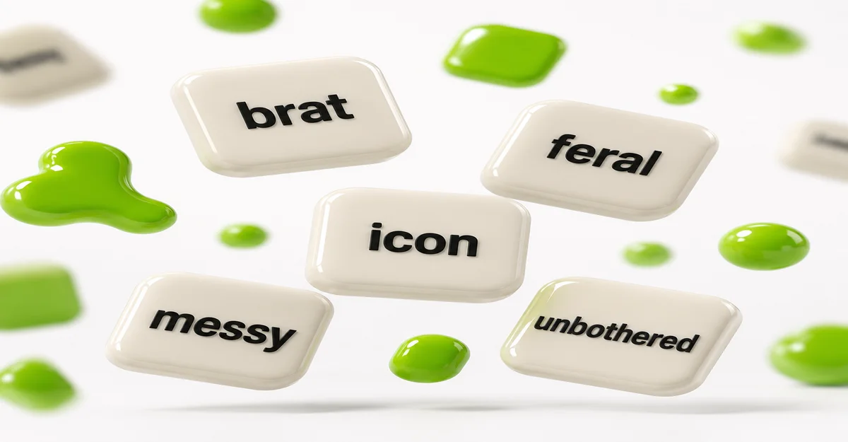
These 100 brat words and phrases are short, blunt, and a little confrontational – single words like “brat,” “feral,” or “unbothered,” or two-to-three-word phrases like “main character” or “not today.” They’re grouped below by mood, plus guidance on when a single word works better than a phrase and which settings fit each.
Why Word Choice Matters More Than It Seems
It’s tempting to treat the word as an afterthought and spend all your time on color and blur – but the word is doing most of the actual communication. The brat look is deliberately minimal, so there’s no layout, illustration, or extra graphic element to carry meaning if the word itself is flat or generic. A strong word does the work a whole design brief would otherwise have to do, which is the whole idea behind a dedicated brat word generator in the first place.
Word choice also affects the settings that work best. A single short word can run at a large font size with heavier chaos and still stay readable, since there’s only one word to parse. A longer phrase needs a smaller font size, lighter chaos, and more careful letter spacing – the same settings covered in the recommended settings and one-word vs. phrase sections of the album cover guide.
Attitude & Chaos Words
Blunt, a little unhinged, and confrontational – the closest match to the original album’s tone:
Confidence & Main-Character Words
Bold, self-assured, unbothered by anyone else’s opinion:
Mood & Feelings Words
The quieter, more vulnerable side of the same aesthetic – just as central to the album’s tone as the loud words:
Party & Summer Words
The “brat summer” side of the aesthetic – loud, physical, nightlife-coded:
Short Phrases Instead of One Word
A phrase trades some of the punch of a single word for more specific meaning – useful when a single word doesn’t say quite enough on its own. Keep phrases to two or three words; anything longer starts fighting the font-size and chaos settings covered below.
A few of these are pulled directly from the album era rather than being generic internet phrases: “club classics” and “girl, so confusing” are actual track titles, and “brat summer” is the name of the cultural phenomenon the album’s aesthetic kicked off – worth using deliberately if you want the reference to actually land rather than just look green.
How to Pick the Right Word for Your Design
- Match the word to the use case. A logo or profile picture gets seen small and fast – a single loud word reads better there than a phrase. A full cover or an Instagram post has more room to hold a longer phrase.
- One strong word beats two weak ones. “Feral” alone usually reads better than a vaguer two-word combination trying to say the same thing. Cut instead of combining if a single word already covers it.
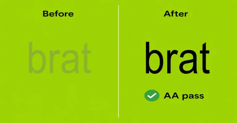
- Let the mood pick the category. Confident and loud pulls from the confidence or party lists above; something more personal or vulnerable fits better from the mood & feelings list – mixing tones from both in one design usually reads as unclear rather than complex. Whichever you pick, the classic green or a font from the font generator still needs to stay legible behind it.
- Check the settings match the length. A single word can take a larger font size and more chaos; a phrase needs both dialed back to stay legible – see the exact ranges in the album cover guide’s settings table.
Common Mistakes
Mistake: Picking a word because it’s trendy rather than because it fits.
A word that doesn’t match what you’re actually trying to say reads as generic no matter how on-trend it is. Pick from the category that matches your actual mood or use case first.
Mistake: Using a full sentence instead of a word or short phrase.
The brat look is built around brevity – a full sentence forces the font size down so far it usually stops looking like the aesthetic at all. Keep it to one to three words.
Mistake: Keeping cover-level chaos on a long phrase.
The heavier chaos settings that work on a single word blur a longer phrase into something unreadable. Dial chaos down as the word count goes up.
FAQ
What’s the best word to use for a brat-style design?
A short, blunt word that actually matches your mood or use case – “brat,” “feral,” and “unbothered” are classic choices, but the right word depends on whether you want loud confidence, a quieter mood, or a party-summer feel.
Should I use one word or a short phrase?
One word works best for anything viewed small or fast, like a profile picture. A two-to-three-word phrase fits better on a full cover or poster where there’s more room and time to read it.
Can I use a full sentence?
You can, but it forces the font size down significantly and works against the brat aesthetic’s brevity. One to three words keeps the look intact.
Are these words from the actual Brat album?
A few: “club classics” and “girl, so confusing” are actual track titles from the album, and “brat summer” is the name of the cultural phenomenon the album’s aesthetic kicked off. Most of the single words are generic mood words that fit the aesthetic rather than direct album references.
Do I need to change my settings based on the word I pick?
Yes. A single word can handle a larger font size and heavier chaos than a phrase can. Longer text needs the font size and chaos dialed back to stay readable.
What if none of these words fit what I want to say?
Use your own word or phrase – this list is a starting point for when you’re stuck, not a fixed set of options. Any short, direct word or phrase works with the aesthetic.
Can I combine two words from different categories?
You can, but mixing tones (a confident word with a vulnerable one, for example) often reads as unclear rather than intentional. Picking from one category at a time usually gives a cleaner result.
What’s a good word for a profile picture specifically?
Something short and legible at a small, often circular size – single words from the attitude or confidence lists tend to work best, since they stay readable even when cropped tightly.
Is “brat” itself overused at this point?
It’s the most direct reference to the aesthetic, so it still works, but the other 99 words and phrases here exist specifically for when you want the same look without using the literal word.
Where do I actually type these words in?
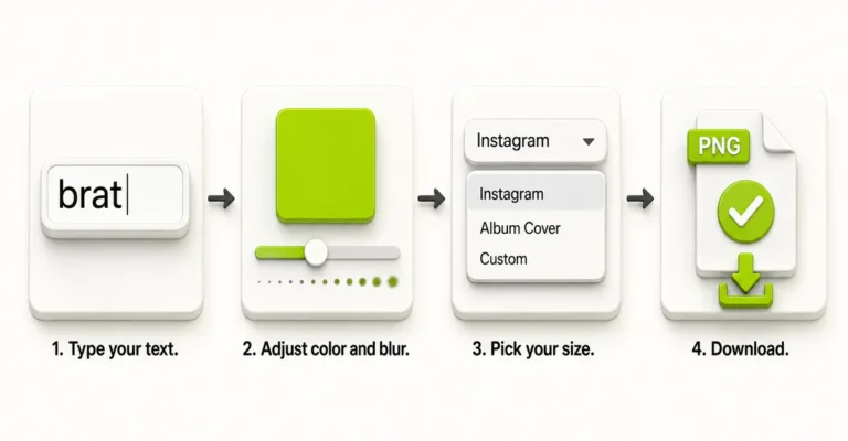
Into the text field of a brat generator – type or paste the word or phrase, then adjust font size, spacing, and chaos to match, as covered in the album cover guide’s settings table.