How to Make a Brat Logo Online for Free
The right settings, a transparent background, and the export format that keeps it sharp at any size.
In this guide
- Quick answer
- Step-by-step: how to make a brat logo
- A logo is not a shrunk-down cover
- Recommended settings for a logo
- Why a transparent background matters
- PNG vs WebP vs SVG for a logo
- Best sizes: favicon, profile picture, website header
- Keeping it readable at a small size
- Common mistakes
- Making a logo on mobile
- Brat logo generator vs Canva vs a logo maker
- FAQ
To make a brat logo online for free, type a short word or initials, set the background to transparent instead of solid green, keep the chaos/blur setting low so the mark stays legible at a small size, then export as PNG or SVG to preserve the transparency. A brat-style logo needs different settings than a brat-style album cover, since it has to stay readable at favicon and profile-picture sizes, not just look good large.
Step-by-Step: How to Make a Brat Logo
These steps work with any browser-based brat generator that supports a transparent background, including the free tool on this site:
- Type a short mark, not a sentence. A single word, a short name, or initials work best – a logo gets used small often enough that anything longer becomes hard to read at a glance.
- Switch the background to transparent. A solid green background works for a cover; a logo usually needs to sit on top of other colors, so pick the transparent background option instead of the default solid fill.
- Keep the chaos/blur setting low. The heavy distressed blur that makes a great album cover makes a bad logo, since it blurs the letterforms right when you need them crisp. Start near zero and only add a small amount if you want a slight texture.
- Check it at a small size before exporting. Zoom your browser out, or shrink the preview, and confirm the text still reads clearly around 64px – that’s close to how it’ll actually appear as a profile picture or favicon.
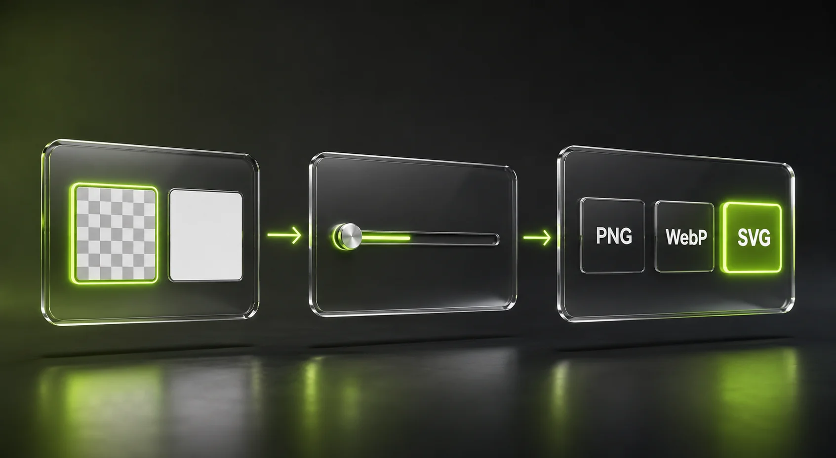
- Export as PNG or SVG. Both keep the transparent background; SVG additionally lets you resize the file to any dimension later without quality loss.
You can create your own with the free brat generator on this site – it has a transparent background option and an SVG export built in, so steps 2 and 5 above are a single click each rather than a manual image-editing step.
A Logo Is Not a Shrunk-Down Cover
The single biggest reason a brat-style logo comes out looking wrong isn’t the color or the font – it’s using cover settings on a logo. An album cover is viewed large, once, usually at full size on a phone screen or a streaming app – so a soft blur and a slight skew read as a deliberate style choice. A logo gets viewed small, repeatedly, often at sizes as tiny as a 16px browser tab icon or a 40px profile circle. At that size, the same blur that looks intentional on a cover just looks like a mistake – blurry, low-quality, or broken.
The fix isn’t a different tool – it’s different settings on the same one. Treat “logo” and “cover” as two separate jobs for the generator, even though they share the same underlying brat aesthetic. For the cover-specific settings (heavier chaos, square or story sizing), see the brat album cover guide instead.
Recommended Settings for a Logo
Here’s where to start, using the same sliders as the cover guide but pushed in the opposite direction on chaos:
| Setting | Typical Range | Good Starting Point for a Logo |
|---|---|---|
| Font size | 24-260px | 140-200 for a single short word or initials |
| Letter spacing | -10 to 40 | -2 to -4, matching the condensed brat look without crowding letters at small sizes |
| Line height | 70-160 | 100, and avoid stacking a logo across multiple lines if it can be avoided |
| Chaos (blur + skew + noise combined) | 0-100 | 0-15 – just enough for a hint of texture, not enough to soften the letterforms |
That chaos range is the one number worth remembering: at 0-15, the effect works out to roughly 0-0.45px of blur and 0-1.2 degrees of skew, which is close to imperceptible at a glance but keeps edges crisp when the logo gets shrunk down. Compare that to the 50-70 chaos range recommended for a cover, which pushes blur toward 1.5-2.1px and skew toward 4-5.6 degrees – fine on a large cover, but enough to visibly soften thin letterforms once a logo is reduced to icon size.
Why a Transparent Background Matters
A logo almost never sits on a plain white or plain green page the way a cover does – it goes on a navbar, a business card, a dark-mode app, a colored product mockup, or over a photo. A solid-color background behind your logo turns into a visible box the moment it’s placed anywhere other than a matching background, which reads as a mistake rather than a design choice.
Switching the background type to transparent instead of solid removes that box entirely, so only the text itself renders – letting the logo sit cleanly on top of whatever’s actually behind it. This is a one-click setting change, not a separate editing step, on any generator that supports it. If you only need the styled text itself with no background at all, the brat text generator is built specifically for that transparent, text-only case.
PNG vs WebP vs SVG for a Logo
All three keep transparency, but they’re not equally suited to how a logo actually gets reused:
| Format | Best For | Watch Out For |
|---|---|---|
| PNG | Most immediate uses – website, social profile, sharing a preview | Fixed resolution – upscaling a small PNG later looks soft |
| WebP | Smaller file size than PNG while keeping transparency | Still a fixed resolution, same upscaling limit as PNG |
| SVG | A logo used at many different sizes – favicon, header, print, app icon | Best for flat, text-based marks like this, not photo-style backgrounds |
A logo is exactly the case SVG is built for: the same file needs to work as a tiny favicon and as a large printed sign, and a vector file scales to both without redoing anything. Export a PNG for quick, immediate use, and keep the SVG as your master file for anywhere the logo needs to be resized later. JPG is worth ruling out entirely here – it has no transparency support, so a logo exported as JPG gets a solid white box behind it regardless of what background type you picked in the tool.
Best Sizes: Favicon, Profile Picture, Website Header
A generator built around social-media and print presets won’t necessarily have a dedicated “favicon” size, so use the custom size option and these targets instead:
| Use Case | Recommended Size |
|---|---|
| Browser favicon | Export at 512 x 512 px, then resize down – most site platforms generate the smaller favicon sizes (16px, 32px, 48px) from one larger master image automatically |
| Social profile picture | 500 x 500 px minimum, square |
| App icon / avatar | 512 x 512 px or 1024 x 1024 px, square |
| Website header logo | Export as SVG where possible, or a PNG at least 2x the largest display size to stay sharp on high-resolution screens |
| Business card / print | Export at 300 DPI for the final print size – see the DPI explanation in the album cover guide for the pixel-to-inch math |
Export one large master file (512 x 512 px or bigger, or SVG) and resize down from there for smaller placements, rather than exporting a separate small file for each use – a larger source file always resizes down cleanly, but a small file resized up gets soft or pixelated.
Keeping It Readable at a Small Size
A logo that looks great at full screen size and unreadable as a 40px circle has failed at the one job a logo actually has. A few checks catch this before you export:
- Keep it short. A single word or two to three initials holds up at small sizes; a full phrase doesn’t.
- Use strong contrast. Dark text on transparent (so it reads against light backgrounds) or light text on transparent (for dark backgrounds) works better than a mid-tone color that can wash out against busy backgrounds. If you do want the classic brat green as an accent somewhere, the brat color code guide has the exact hex value.
- Skip the glow and heavy shadow effects. Both are designed to be noticed at cover size; at icon size they mostly just blur the edges of the letters.
- Test it small before finalizing. Shrink the preview or view the exported file at actual size – not just zoomed in – since that’s the only reliable way to catch a legibility problem before it’s live somewhere.
Common Mistakes
Mistake: Using cover-level chaos on a logo.
A chaos setting of 50 or higher is correct for a distressed album-cover look, but it blurs a logo’s letterforms just enough to look broken once the logo is shrunk to icon size. Keep it under 15 for anything meant to be reused as a logo.
Mistake: Leaving the background solid instead of transparent.
A solid background becomes a visible colored box the moment the logo is placed anywhere other than a matching background. Switch to transparent before exporting.
Mistake: Exporting as JPG.
JPG has no transparency support at all – any transparent area is filled with solid white on export, regardless of what background type was selected in the generator. Use PNG, WebP, or SVG instead.
Mistake: Using a long phrase instead of a short mark.
A logo gets reused at small sizes far more often than a cover does. A long phrase that reads fine at full size becomes unreadable text soup once it’s shrunk to a profile picture or favicon.
Mistake: Only checking it at full size.
A logo can look sharp and readable zoomed in and still fail completely at 32px. Always check the actual small-size appearance before treating a design as final.
Making a Brat Logo on Mobile
The same process works on a phone browser, with the same practical adjustments as making a cover on mobile:
- Open the generator in your phone’s browser – no app needed, and it works in both Safari and Chrome on mobile.
- Type your short mark or initials using the on-screen keyboard.
- Switch the background type to transparent with a tap, same control as desktop.
- Keep the chaos slider low – tap-and-drag it near zero rather than the higher setting you might use for a cover.
- Use the Copy button if Download behaves unreliably. Some mobile browsers handle downloads inconsistently; copying the image and pasting it into another app is usually more reliable on mobile.
Brat Logo Generator vs Canva vs a Dedicated Logo Maker
Each of these fits a different amount of design work:
A purpose-built brat generator already has the right font and the transparent-background option ready – the main adjustment is dialing chaos down from a cover-style default, which takes seconds. It’s the fastest path if you already know you want the brat aesthetic specifically.
Canva gives more layout flexibility – combining the mark with other shapes or a tagline – but you’ll set the font, spacing, and transparency yourself, and full-resolution export typically needs an account.
A dedicated logo maker (Looka, Tailor Brands, and similar) is built for generating multiple logo concepts and often bundles brand-kit extras like color palettes and social templates, but it isn’t built around the specific brat aesthetic – you’d be starting from a generic template and pushing it toward that look rather than starting from it.
For a brat-style mark made quickly and correctly, a dedicated brat generator is the most direct path. For a fuller brand identity that happens to use a brat-style mark as one piece, Canva or a logo-maker platform make more sense as the primary tool.
FAQ
How do I make a brat logo for free?
Use a free browser-based brat generator: type a short word or initials, switch the background to transparent, keep the chaos/blur setting low, and export as PNG or SVG. No account or payment is required.
What’s the difference between a brat logo and a brat album cover?
A cover is viewed large and benefits from heavier blur and skew for the distressed look. A logo gets viewed small and often, so it needs low chaos, a transparent background, and text short enough to stay readable at icon size.
Should a brat logo have a green background?
Not usually. A transparent background lets the logo sit on any color or photo behind it. Keep the solid green look for a cover or poster instead, where a fixed background is expected.
What file format should I use for a brat logo?
PNG or SVG. Both keep the transparent background; SVG additionally scales to any size without quality loss, which matters more for a logo than for a one-off cover.
Why does my logo look blurry when I shrink it?
This is almost always the chaos/blur setting left too high, or a PNG/JPG exported small and then enlarged afterward. Lower the chaos setting before export, and export a larger master file if you need multiple sizes.
Can I use a brat logo as my favicon?
Yes. Export at a larger size such as 512 x 512 pixels, then use your website platform’s favicon settings to generate the smaller sizes (16px, 32px, 48px) from that master image.
How much text should a logo have?
As little as possible – a single word or two to three initials. Anything longer reads fine large but turns into unreadable text once shrunk to a profile picture or favicon size.
Do I need design software to make one?
No. A browser-based brat generator with a transparent-background option and PNG/SVG export covers everything needed for a simple text-based logo.
Can I resize my brat logo later without it looking blurry?
Only if you export it as SVG, or keep a large PNG/WebP master file and scale down from that. A small PNG or WebP file enlarged after the fact will look soft no matter how it was originally made.
Does this work on mobile?
Yes. Browser-based brat generators typically work on both desktop and mobile without an app download, including the transparent-background and export options.