Best Fonts Similar to the Brat Font
The closest free match, plus what to use when Arial Narrow isn’t an option at all.
In this guide
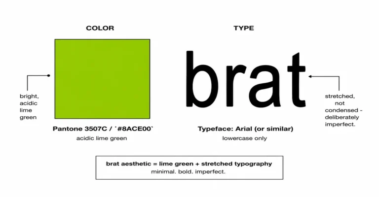
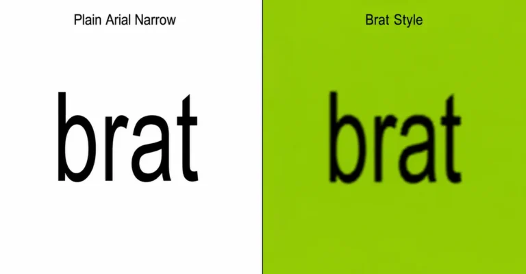
Looking for fonts similar to the brat font? The brat font itself is Arial Narrow, and it’s already free – it ships with Windows and macOS by default, so most people don’t need a substitute at all. When you do need one – for web design, Google Slides, or Linux, where Arial Narrow isn’t available – Liberation Sans Narrow is the closest free match, since it was built to be metrically compatible with the Arial family. For a Google Fonts option, Archivo Narrow and Barlow Condensed are the closest in spirit.
Do You Actually Need an Alternative?
Before hunting for a substitute, it’s worth checking whether you already have the real thing. Arial Narrow ships as a default system font on both Windows (bundled since early Office releases) and macOS (included in /Library/Fonts/ on every current version). If you’re designing in Word, PowerPoint, Photoshop, or any desktop app on either of those systems, Arial Narrow is very likely already installed and available in your font dropdown – no download needed. For the full background on why this specific font was chosen for the original cover, see what font does brat use.
The real gap shows up in a few specific situations: building a web page where fonts need to be loaded from a service like Google Fonts, working in Google Slides or Google Docs (which only offers Google’s own font library), using Linux, or using a browser-based design tool that only ships with its own curated font list. That’s the actual use case this guide is for.
The Closest Free Match: Liberation Sans Narrow
Liberation Sans Narrow is the most accurate free alternative available, because it wasn’t designed to just “look similar” – it was built specifically as a metrically compatible replacement for the Arial family, meaning it shares the same character widths and spacing so that documents made in one font don’t reflow when opened with the other. It’s open-source, developed by Red Hat, and ships by default with LibreOffice.
The catch: Liberation Sans Narrow isn’t on Google Fonts, so it’s not a drop-in option for a website using a Google Fonts embed. It needs to be downloaded and either installed locally or self-hosted as a web font if you want to use it in a browser-based design.
Best Google Fonts Alternatives
If you specifically need something available through Google Fonts – for a website, Google Slides, or any tool that only pulls from that library – none of these are metrically identical to Arial Narrow, but they cover the same condensed, no-frills territory:
| Font | Character | Best For |
|---|---|---|
| Archivo Narrow | Clean, grotesque-style condensed sans, closest in spirit to Arial Narrow’s plainness | General text, web body copy needing a narrow feel |
| Barlow Condensed | Rounder terminals, wide weight range from thin to black | Headlines and titles where you want weight options |
| PT Sans Narrow | Designed for legibility at small sizes | Dense layouts, small captions, UI text |
| Oswald | Taller, more stylized condensed letterforms – closer to a display font | Bold headlines and poster-style text, less suited to long body copy |
| Fira Sans Extra Condensed | Very tight, technical feel, part of a large full type family | Data-dense interfaces, technical or editorial layouts |
Of these, Archivo Narrow reads closest to Arial Narrow’s plain, unstyled character – it’s the one to start with if you want the brat look to read as understated rather than designed.
A Bolder, More Designed Alternative
Some people searching for a brat font alternative aren’t after a narrow match at all – they want a similar bold, modern energy for a logo or brand mark rather than a literal copy of the album cover’s proportions. If that’s the goal, the reference points shift to geometric sans-serif fonts like Futura, Avenir, and Proxima Nova – all common choices for clean, confident branding, and all worth knowing upfront require a paid license.
The one free option in that category is Montserrat, available on Google Fonts at no cost. It shares the same large x-height and geometric structure that make Futura and Proxima Nova feel modern, which is why it’s commonly used as the free stand-in for both. It won’t replicate Arial Narrow’s condensed proportions – it’s a different design direction entirely – but for a bolder, brand-style take on the aesthetic rather than a strict album-cover match, it’s the one worth trying first.
Getting the Brat Look With Any of These Fonts
The font is only one part of the look. Whichever font you use, the same three adjustments do most of the work:
- Lowercase throughout. The original cover uses no capital letters at all, regardless of font.
- Tight letter spacing. A slightly negative letter-spacing value pulls the font toward the condensed, crowded look of the original, even on fonts that aren’t naturally as narrow as Arial Narrow.
- A soft blur. None of the fonts above include this by default – it has to be added separately, either through a design tool’s blur effect or a canvas-based generator that applies it automatically.
- The right background color. None of this matters much on the wrong shade of green – see the brat color code guide for the exact verified hex value.
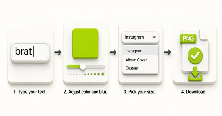
If you’d rather not hunt down a font file and configure spacing and blur by hand, the brat font generator on this site already has Arial Narrow and seven other fonts built in, with spacing, weight, and blur controlled live from one screen, and the brat generator tool itself for the full editor with position and export controls too.
Where Each Font Works
| Situation | What to Use |
|---|---|
| Word, PowerPoint, Photoshop (Windows or Mac) | Arial Narrow directly – it’s already installed |
| Website using Google Fonts | Archivo Narrow or Barlow Condensed |
| Google Docs / Google Slides | Archivo Narrow or PT Sans Narrow (both available in Google’s font picker) |
| Linux desktop | Liberation Sans Narrow, usually pre-installed or available via your distro’s package manager |
| Quick social image, no font hunting | A browser-based brat generator with Arial Narrow built in |
Common Mistakes
Mistake: Assuming you need a substitute before checking if Arial Narrow is already installed.
It ships by default with Windows and macOS. Check your font list first – a substitute is only needed for web design, Google’s own apps, or Linux.
Mistake: Stretching a wide font instead of choosing a genuinely condensed one.
Horizontally scaling a normal-width font distorts curved letters like “a” and “e.” Pick a font that’s condensed by design rather than stretching one that isn’t.
Mistake: Expecting a Google Font to be an exact metric match.
None of the Google Fonts alternatives share Arial Narrow’s exact character widths the way Liberation Sans Narrow does. They’ll look similar, not identical – fine for a social graphic, not for a document that needs to reflow identically.
Mistake: Skipping letter spacing and blur and expecting the font alone to sell the look.
Any of these fonts read as “just a condensed font” without tightened spacing and a soft blur added on top. Pairing the right words with the right font matters too – see 100 brat words for ideas that fit the format.
FAQ
What font does the brat album cover actually use?
Arial Narrow, in lowercase, with tightened letter spacing and a soft blur applied on top.
Do I even need a substitute font?
Probably not for desktop design – Arial Narrow ships by default with both Windows and macOS. A substitute is mainly needed for web design, Google Docs/Slides, or Linux.
What’s the closest free font to Arial Narrow?
Liberation Sans Narrow, since it was specifically built to be metrically compatible with the Arial family – matching character widths, not just general style.
Is Arial Narrow available on Google Fonts?
No. Arial Narrow is not hosted on Google Fonts. Archivo Narrow and Barlow Condensed are the closest available alternatives there.
Which Google Font looks most like Arial Narrow?
Archivo Narrow, since its plain, unstyled character is closest to Arial Narrow’s default look compared to more stylized options like Oswald.
Can I use these fonts in Canva?
Canva includes Arial Narrow directly in its free font library, so a substitute usually isn’t needed there specifically – see the Canva-specific guide for details.
Does the font alone get me the brat look?
No. Lowercase text, tightened letter spacing, and a soft blur all need to be added on top of any of these fonts to match the original cover’s style.
Is Liberation Sans Narrow free to use commercially?
Yes. It’s released under the SIL Open Font License, which permits commercial use without a licensing fee.
Why doesn’t my Google Slides have Arial Narrow?
Google Slides only offers fonts from the Google Fonts library, and Arial Narrow isn’t part of it. Use Archivo Narrow or PT Sans Narrow instead, both of which are available there.
Is there a faster way to get the exact look without installing a font?
Yes – a browser-based brat generator with Arial Narrow already built in skips the font-hunting step entirely, since the correct font, spacing, and blur are already set as defaults.
What if I want a bolder, more brand-style alternative instead of a narrow match?
Montserrat is the closest free option, sharing the geometric structure of premium fonts like Futura and Proxima Nova. It won’t match Arial Narrow’s condensed proportions, but it works well for a bolder, more designed take on the aesthetic.