Best Colors That Go with Brat Green
The best colors to pair with brat green, worked out by color theory rather than guesswork.
In this guide
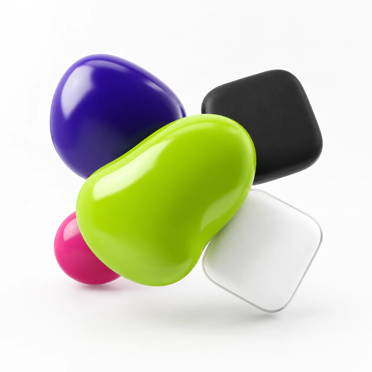
Brat green (#8ACE00) pairs most reliably with black and white as clean neutrals, with a deep indigo-violet as its true color-wheel complement, and with hot pink or magenta for the loud, Y2K-rave-adjacent look most associated with the aesthetic. Which one to use depends on whether you want a minimal, a bold, or a softer palette – covered below with the actual color math, not just a list of guesses.
Why Brat Green Is Tricky to Pair
Brat green isn’t a neutral, calm green – measured in HSL it sits at roughly 80° hue, 100% saturation, and 40% lightness, which puts it closer to an acid yellow-green than a true grass or forest green. That high saturation is exactly what makes it hard to pair casually: put it next to another highly saturated color and the two compete for attention instead of working together. Most successful pairings either go fully neutral (black, white, gray) to let the green carry all the color weight, or deliberately lean into the clash with an equally loud second color.
Classic Neutral Pairings
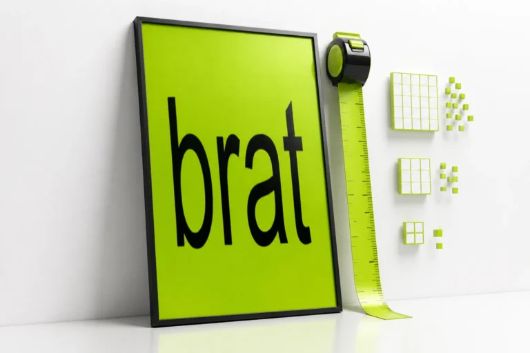
Black and white are the safest pairings by a wide margin, and they’re also the pairing the aesthetic itself is built on – the original album cover is just black text on the green, nothing else. For which of the two works better as text specifically, that’s a readability question rather than a palette one, and it’s already answered in detail (with the real contrast-ratio numbers) in the brat color code guide’s contrast section – short version, black clears accessibility contrast comfortably and white doesn’t.
As a palette rather than a text color, gray works as a third neutral – a mid-to-dark gray background or accent lets the green stay the single loud element in an otherwise quiet design, useful for anything where the green needs to read as an accent rather than the whole point.
The True Complementary Color
On a standard color wheel, the color directly opposite brat green’s roughly 80° hue lands at roughly 260° – a deep indigo-violet, close to #4400CE, not the pink or magenta a lot of quick guides assume. That’s worth knowing because “green’s complement is pink” is a common shortcut that’s only true for a true, neutral green – brat green’s yellow lean shifts its true complement further toward violet.
In practice, a true complementary pairing like this reads as bold and slightly clashing by design – useful for a poster, a merch design, or anything meant to grab attention fast, less useful for something meant to look calm or minimal.
Analogous Pairings
Analogous colors sit next to brat green on the wheel rather than opposite it, which makes them blend rather than contrast. Roughly 30° in either direction from brat green lands on a mustard-gold (#CEAB00) on one side and a true, slightly cooler green (#23CE00) on the other. These work well when you want a palette that feels cohesive and single-toned rather than punchy – a gradient background, a multi-shade poster, or a softer take on the aesthetic that doesn’t rely on a hard contrast to work.
Bold, High-Contrast Pairings
Beyond the strict color-wheel math, a few pairings show up constantly in the “brat summer” visual culture around the album, because they lean into contrast rather than harmony:
- Hot pink or magenta. Not the literal color-wheel complement, but close enough in spirit – loud, saturated, and part of the same maximalist-Y2K color language the aesthetic draws from.
- Cobalt or electric blue. A strong contrast without the near-clash of a true complement – works well for a two-color palette that still needs to feel calm enough to read text against.
- Black plus one loud accent. Rather than pairing green with another bright color directly, use black as the dominant background and drop a single loud accent color (pink, blue, or the green itself) in sparingly – keeps a busy palette from fighting itself.
Softer, Pastel Pairings
Pastels – blush pink, lavender, cream – can work with brat green, but honestly, they work against the aesthetic’s whole point more often than not. The look is built on saturation and confrontation, not softness, so pairing it with muted pastels tends to read as a generic “spring palette” rather than anything connected to the brat look specifically. If a softer palette is genuinely what you want, it’s a legitimate design choice – just know it’s trading the aesthetic’s core identity for a calmer one, not a variation of it.
The Built-In Gradient Pairing
Worth knowing if you’re using a brat generator rather than building a palette from scratch: the default “Classic” gradient preset pairs the standard green (#8ACE00) with a brighter yellow-green (#eaff00) for a subtle two-tone background rather than a flat fill. It’s a real, built-in pairing rather than a suggestion – useful as a starting point if you want some depth in the background without introducing a second, unrelated color.
Palettes by Use Case
| Use Case | Suggested Pairing | Why |
|---|---|---|
| Social media post / cover | Green + black | Matches the original aesthetic exactly, highest legibility |
| Merch / poster design | Green + indigo-violet or hot pink | Bold contrast reads well at a glance and holds up printed large |
| Multi-slide carousel or gradient background | Green + mustard-gold or true green (analogous) | Cohesive tone across multiple panels without clashing |
| Brand palette / logo needing a calmer accent | Green + gray + black | Green stays the single loud element; gray keeps the rest of the palette quiet |
Common Mistakes
Mistake: Pairing brat green with another highly saturated color of similar lightness.
Two equally loud colors at a similar lightness level tend to vibrate against each other rather than pair – if going bold, contrast lightness too (a dark violet or blue, not another bright, light color).
Mistake: Assuming pink is automatically the complementary color.
That’s true for a neutral green, not for brat green’s yellow-leaning hue – its actual color-wheel complement sits closer to indigo-violet.
Mistake: Using white text or a white background element without checking contrast.
This is a readability issue, not a palette one – see the brat color code guide for the actual contrast-ratio numbers before finalizing any design where the green sits behind text.
FAQ
What color pairs best with brat green?
Black and white are the safest, most classic pairings. For a bolder palette, a deep indigo-violet (its true color-wheel complement) or hot pink both work well for a high-contrast look.
Is pink the complementary color to brat green?
Not exactly. Brat green’s yellow-leaning hue puts its true color-wheel complement closer to indigo-violet. Pink and magenta pair well for a different reason – they match the loud, maximalist visual culture around the aesthetic, not strict color theory.
Does brat green work with pastel colors?
It can, but pastels work against the aesthetic’s saturated, confrontational identity more than they support it. A pastel pairing reads as a generic soft palette rather than a variation on the brat look specifically.
What’s a good two-color palette for a brat-style poster?
Green plus black is the most direct match to the original aesthetic. Green plus indigo-violet or hot pink gives a bolder, more attention-grabbing two-color result for something like a poster or merch design.
Can I use brat green with another shade of green?
Yes – an analogous, slightly cooler true green or a mustard-gold sit close to it on the color wheel and blend rather than clash, useful for a gradient or multi-panel design that needs to feel cohesive.
What background does the brat generator use by default?
A flat #8ACE00 by default, with a built-in gradient preset that pairs it with a brighter yellow-green (#eaff00) if you want subtle depth instead of a flat fill.
Is black or white better as a background alongside brat green?
Both work as palette neutrals. As text color directly on top of the green specifically, black passes accessibility contrast checks and white does not – see the brat color code guide for the full breakdown.
What colors should I avoid pairing with brat green?
Other highly saturated colors at a similar lightness level tend to compete with it rather than complement it. If pairing with another bold color, contrast the lightness too – a dark, saturated color reads better alongside it than another bright, light one.
Is there an official “brat color palette”?
No official multi-color palette has been published beyond the green and black used on the cover itself – the pairings here are based on color theory and the broader visual culture around the aesthetic, not an official brand guideline.
Does the pairing matter for social media specifically?
Mostly for legibility rather than the pairing itself – a busy multi-color background behind text reads worse at thumbnail size on a feed or story than a simple green-and-black or green-and-white combination.